Flutter 系列(五):Flutter 常用按钮 Widget

前言
很高兴遇见你~
在本系列的上一篇文章中,我们通过:效果展示 -> Widget 介绍 -> 代码实现的方式对 Image,ListView,GridView,Stack 进行了介绍,并穿插讲解了一些其它 Widget ,最后通过一个综合案例对学习的 Widget 进行了组合使用。还没有看过上一篇文章的朋友,建议先去阅读 Flutter 系列(四):Flutter 常用 Widget 二。接下来我们对 Flutter 按钮 Widget 进行学习
Flutter 中的按钮 Widget 有很多,常见的按钮 Widget 有:RaisedButton,FlatButton,IconButton,OutlineButton,ButtonBar,FloatingActionButton 等,下面就介绍一下这些常用的 Widget
一、Flutter 常用按钮 Widget 介绍
1.1、Flutter 按钮 Widget 通用属性
首先介绍一下,按钮 Widget 都有的一些属性:
| 属性名称 | 属性类型 | 说明 |
|---|---|---|
| onPressed | VoidCallback | 此项为必填参数,按下按钮时触发的回调,接收一个方法作为参数,传 null 表示按钮禁用,会显示禁用相关样式 |
| child | Widget | 子控件,一般我们会使用文本 Widget 来填充 |
| textColor | Color | 文本颜色 |
| color | Color | 按钮背景颜色 |
| disabledColor | Color | 按钮禁用时的背景颜色 |
| disabledTextColor | Color | 按钮禁用时的文本颜色 |
| splashColor | Color | 点击按钮时的水波纹颜色 |
| highlightColor | Color | 长按按钮后按钮的背景颜色 |
| elevation | double | 按钮阴影的范围,值越大阴影范围越大 |
| padding | EdgeInsetsGeometry | 內边距 |
| shape | ShapeBorder | 设置按钮的形状,ShapeBorder 实现类有: RoundedRectangleBorder:圆角形状 CircleBorder:圆形形状 |
介绍完了按钮 Widget 的通用属性,接下来我们看下每个按钮初始形态的一个效果,在结合这些按钮做一个综合案例
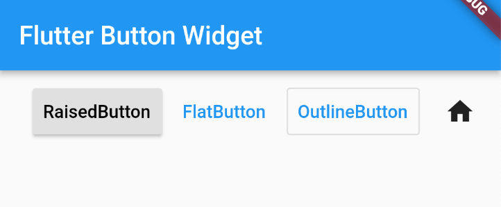
1.2、RaisedButton
RaisedButton 见名知意:凸起的按钮,其实就是 Flutter 给我们提供的 Material Design 风格的按钮:
运行如下代码:
1 | |
效果展示:
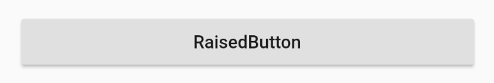
默认情况下是一个灰色背景的凸起按钮
1.3、FlatButton
FlatButton 见名知意:扁平的按钮,和 RaiseButton 刚好相反,没有凸起的效果。将上述 RaiseButton 换成 FlatButton 效果如下:
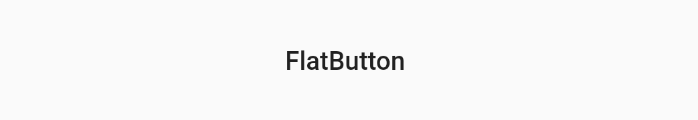
可以看到,它没有背景,就像一个文本 Widget 一样
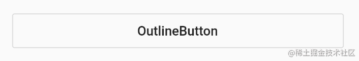
1.4、OutlineButton
OutlineButton 见名知意:带线框的按钮,它就像是 FlatButton 加了一个边框。将上述 RaiseButton 换成 OutlineButton 效果如下:
1.5、IconButton
IconButton 见名知意:带 Icon 的按钮。将上述 RaiseButton 换成 IconButton 并做属性的调整:
1 | |
效果如下:
1.6、ButtonBar
ButtonBar 是一个按钮组,我们可以在它的 children 属性中放入多个按钮,如下代码:
1 | |
效果:
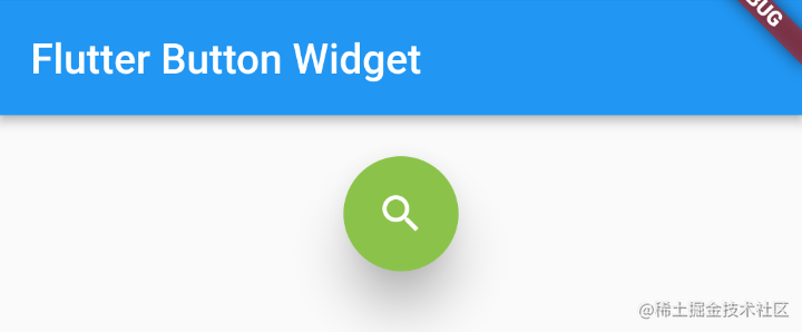
1.7、FloatingActionButton
FloatingActionButton 简称 FAB,可以实现浮动按钮。它常用的一些属性:
| 属性名称 | 属性类型 | 说明 |
|---|---|---|
| onPressed | VoidCallback | 此项为必填参数,按下按钮时触发的回调,接收一个方法作为参数,传 null 表示按钮禁用,会显示禁用相关样式 |
| child | Widget | 子控件,一般为 Icon,不推荐使用文字 |
| backgroundColor | Color | 背景颜色 |
| elevation | double | 未点击时候的阴影 |
| highlightElevation | double | 点击时的阴影值,默认为:12.0 |
| shape | ShapeBorder | 定义 FAB 的形状 |
| mini | bool | 是否是 mini 类型,默认为:false |
如下代码:
1 | |
效果:
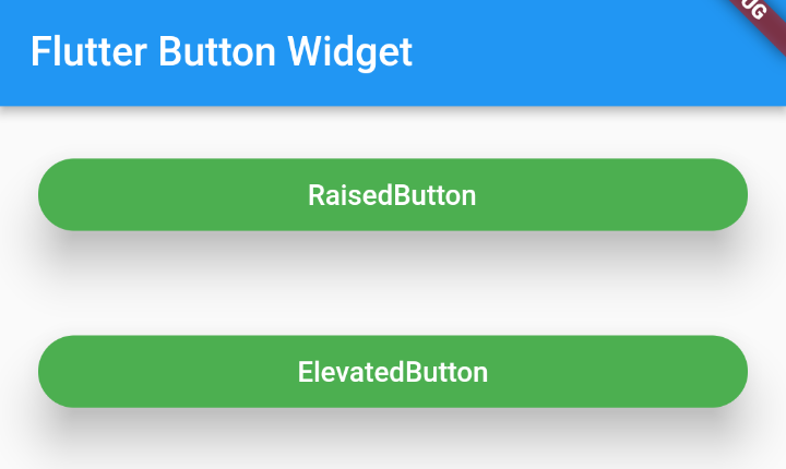
二、Flutter 2.x 按钮 Widget 的变化
如果你是 Flutter 2.x 的版本,你会发现之前的一些按钮 Widget 被废弃了:
主要是上面这三个按钮的变化,取而代之的是:
| Flutter 1.x 中的按钮 Widget | Flutter 2.x 中的按钮 Widget |
|---|---|
| RaisedButton 凸起按钮 | ElevatedButton 凸起按钮 |
| FlatButton 扁平按钮 | TextButton 扁平按钮 |
| OutlinedButton 线框按钮 | OutlinedButton 线框按钮 |
另外在 1.x 中设置的一系列属性,如:color,textColor,elevation,shape等在 2.x 中都被封装到了 style 属性中,style 属性接收一个 ButtonStyle 类型的对象,介绍一下 ButtonStyle 中的常用属性:
| 属性名称 | 属性类型 | 说明 |
|---|---|---|
| textStyle | MaterialStateProperty |
文本的样式 但是对于颜色是不起作用的 |
| backgroundColor | MaterialStateProperty |
按钮背景色 |
| foregroundColor | MaterialStateProperty |
文本及图标颜色 |
| overlayColor | MaterialStateProperty |
高亮色,按钮处于 focused,hovered or pressed 时的颜色 |
| shadowColor | MaterialStateProperty |
阴影颜色 |
| elevation | MaterialStateProperty |
按钮阴影的范围,值越大阴影范围越大 |
| padding | MaterialStateProperty |
按钮内边距 |
| minimumSize | MaterialStateProperty |
按钮最小值 |
| fixedSize | MaterialStateProperty |
按钮大小 |
| maximumSize | MaterialStateProperty |
按钮最大值 |
| side | MaterialStateProperty |
边框 |
| shape | MaterialStateProperty |
设置按钮的形状 |
| alignment | AlignmentGeometry | 按钮子 Widget 对齐方式 |
实践对比:
1 | |
效果:
三、按钮 Widget 组合之综合案例
在讲综合案例之前我们先学习下 BottomNavigationBar ,一会会用到
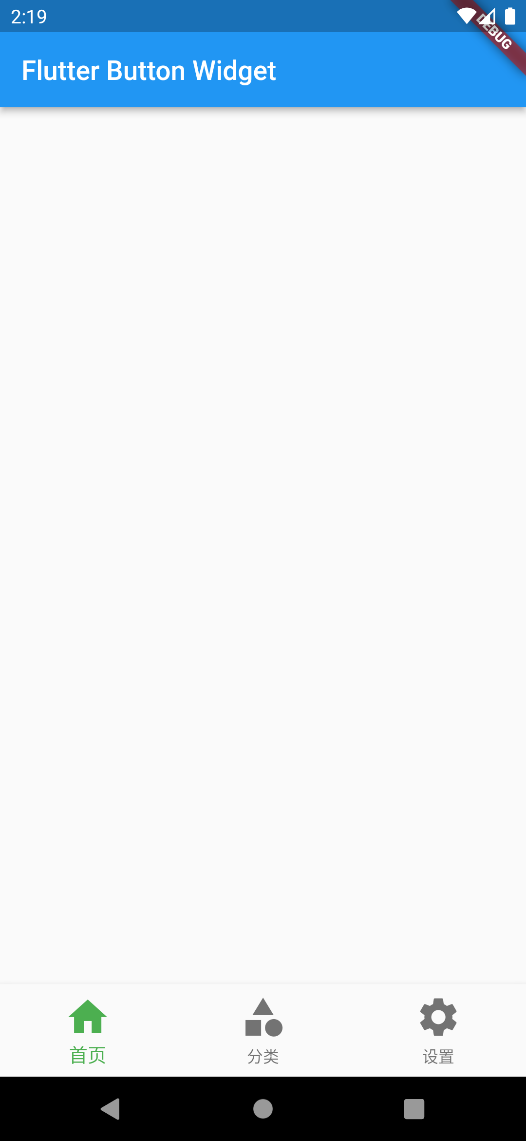
3.1、BottomNavigationBar 介绍
BottomNavigationBar 是 Flutter 给我们提供的底部导航栏 Widget,一般用在 Scaffold 的 bottomNavigationBar 属性中
BottomNavigationBar 常用属性介绍:
| 属性名称 | 属性类型 | 说明 |
|---|---|---|
| items | List |
必须属性,最少要有两个子 Widget |
| onTap | ValueChanged | Widget 点击事件 |
| currentIndex | int | 当前显示的是哪个 Widget |
| elevation | double | 阴影范围 |
| type | BottomNavigationBarType | BottomNavigationBarType.fixed:固定 BottomNavigationBarType.shifting:可滑动 |
| fixedColor | Color | 相当于 selectedItemColor,但是不能跟 selectedItemColor 同时存在 |
| backgroundColor | Color | 背景颜色 |
| iconSize | double | 设置图标大小 |
| selectedItemColor | Color | 设置 Widget 选中的颜色 |
| unselectedItemColor | Color | 设置 Widget 未选中的颜色 |
| selectedFontSize | double | 设置 Widget 选中时文字的大小 |
| unselectedFontSize | double | 设置 Widget 未选中时文字的大小 |
运行下面代码:
1 | |
效果:
3.2、综合案例
接下来我们就使用按钮 Widget 组合来实现如下效果:
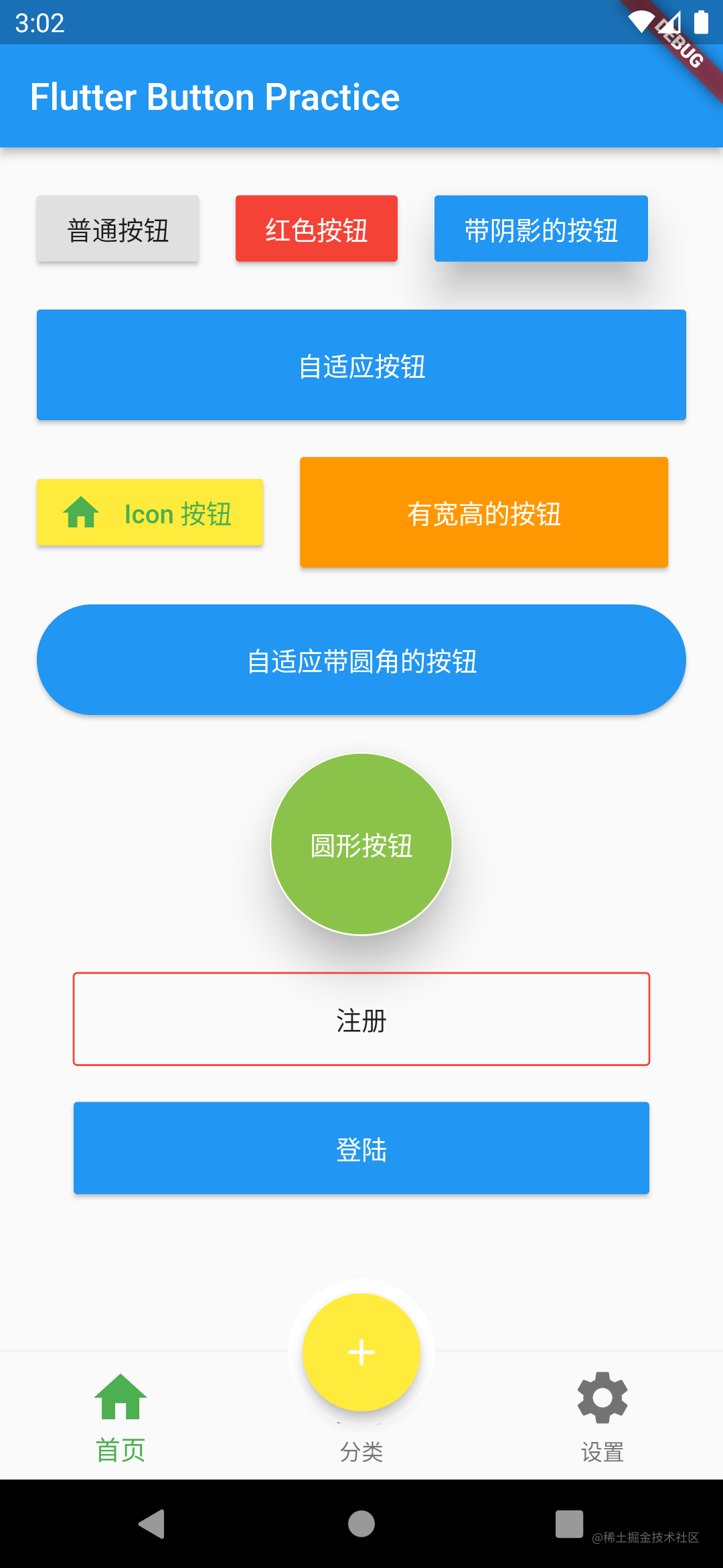
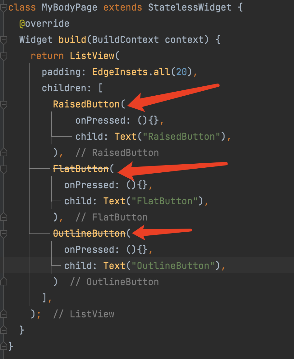
简单的分析下这个页面:最外层有个内间距(Padding),接下来就是一个从上往下排列的垂直布局(Column),垂直布局里面有一系列使用 button 实现的按钮,简单起见,我们这里使用 Flutter 1.x 系列的 Button 去实现,最后底部有一个 BottomNavigationBar,BottomNavigationBar 中间有一个凸起的 FloatingActionButton,类似咸鱼中间发布按钮的效果。
接下来,我们就用代码实现一下:
1 | |
四、总结
本篇我们讲了:
1、Flutter 中常用的按钮 Widget :RaisedButton,FlatButton,IconButton,OutlineButton,ButtonBar,FloatingActionButton
2、介绍了 Flutter 1.x 和 Flutter 2.x 按钮相关的变化及使用
Flutter 2.x 中常用的属性都被封装到了 style 属性中
3、介绍了 BottomNavigationBar,并通过 Flutter 1.x 相关 Button + BottomNavigationBar + FloatingActionButton 实现了一个综合案例
好了,本篇文章到这里就结束了,希望能给你带来帮助 🤝
感谢你阅读这篇文章
下篇预告
下篇文章我会介绍 Flutter 表单相关 Widget ,尽请期待吧😄
参考和推荐
Flutter 教程:通俗易懂的 Flutter 入门教程
你的点赞,评论,是对我巨大的鼓励!
欢迎关注我的公众号: sweetying ,文章更新可第一时间收到
如果有问题,公众号内有加我微信的入口,在技术学习、个人成长的道路上,我们一起前进!